Project Iteration 2
Objective
For this iteration, we needed to decide which color picker design we would choose from our 3 prototypes. This decision needed to be made with the difficulties that people with tremor face when using technology. Through literature review, we had some guidelines for further improvements but we wanted to present our thoughts and ideas to an expert to make better decisions.
Design Selection


Out of our three designs, we unanimously believed that the first one presented here, Yaman's, was the best suited for people with tremor. We also believed that it was the most flexible design as there were many parameters that could be adjusted if needed.
Meeting with an Expert
Through the connections with our professors, namely Prof. Cooperstock, we were able to schedule a meeting with Prof. Archambault from McGill's school of Physical & Occupational Therapy. We asked questions like whether pressing a button was difficult, exerting some force, or about the directionality of the tremor. We learned that tremors can be slightly directional but that shouldn't really matter much. We could maybe strengthen the damping in one direction compared to its perpendicular direction. Also, exerting some force such as to press a button is not a problem. We also learned that some days are better than others for patients when it comes to how much it affects them, so customization would be important. Not everyone is affected the same way and even the same person will not have the same needs from one day to the next.
Work Completed
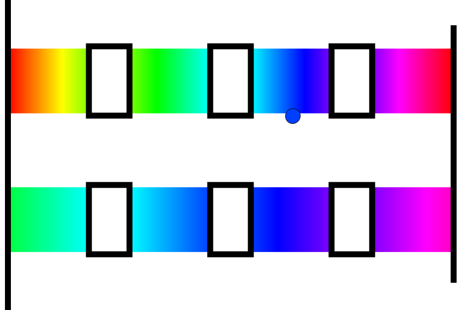
From our selected prototype, we brainstormed on what could be parametrizable to enable customization. We call each of these parameters "dimensions". This was important because the prototype was coded in a way that did not allow for any flexibility so we needed to know what was needed before rebuilding it from the ground up with these dimensions in mind. We decided to parametrize the number of swatches, the ratio of swatch width to the space between each swatch, the distance of the color picker from the left side of the screen, the distance of the color picker from the right side of the screen, whether to use one or two rows of color selection (see images below), the number of pages that are used to select the color, and lastly, the orientation of the color picker, either vertical or horizontal.


From there, we divided tasks so that we would each focus on a separate part of the implementation. My focus was on the colors themselves, the selection process, rendering on screen, and decision of what colors would be displayed on the "next screen".
The way the prototype works is that the user progresses from the top to the bottom of the screen. In the middle are color swatches separated by walls. This enables users to simply move over their desired color to select it. The walls prevent the users from selecting another color once they've committed to one color.
The question that I needed to ask myself was "how do I choose a color and how do I narrow down the options if the upfront options are limited?" I decided that one would first select a color and then select a shade of that color if they want to. However, this system needs to work with a flexible number of swatches. If there are 8 of them, then it's fine because the user can choose from 8 colors and then 8 shades of that color. But if the user chooses to only have 4 swatches since it is too difficult for them to deal with that precision, then 4 colors to choose from is too limiting. Therefore, we will have the possibility of having multiple pages, so once the user has selected a color, which will be represented as a gradient here, then a subset from that gradient is available for selection. The next page will show another subset of colors and/or shades of the selected color.
This enables precise color selection. We did now want our color picker to feel limiting to the user. It is our goal to make it flexible so that someone who wants less options for ease of use can have it, but someone who wants precise color selection because they want to do color accurate work can also use our tool.
Now how does it work in technical terms? Well, to choose different enough color, I am using the HSB (Hue Saturation Brightness) color mode because this enables me to select from the color wheel. The hue corresponds to the pure color from 0 to 360 degrees so I pick each color using the formula c_k=k*360/NUM_SWATCHES where k is the index of the color swatch and NUM_SWATCHES is the number of swatches used. Therefore, I get equidistant colors from the color wheel. When the number of swatches is small, I can use gradients instead to represent a range of colors and I can use the same process except I will render a gradient from c_k to c_k+1. The result can be observed below.
After the user selects a gradient, that gradient will be expanded allowing them to choose a color from that gradient. This process can go on infinitely until the colors are indistinguishable from each other.
The hues are selected by varying the brightness component of the color. This provides a range from the pure saturated color to black.
To go from one page to the next, we are using a "next" button at the bottom of the page, which is in the natural progression of the movement. Once they have pressed this button, they can progress up the color picker. Venissa worked on these buttons so she will tell you all about the design and haptic feel of them.
Our functional final design can be observed in the video below.
Lessons Learned
While working on this iteration, I learned more about the difficulties that people with tremor face when using technology. I learned that some days, their tremor is better than on other days. I learned about the importance of customizability when making such tool, and that a lot of accessible tools will have a wide variety of handles for instance, because interacting with a different shape will make some user's tremors better.
Code
Our code for this project can be found here.